One dimension of my science communication projects is creating visualizations of data and concepts that communicate complex environmental issue to specific audiences, especially non-specialists. This page shows a selection of examples from visualization projects I have led. Please contact me if you are interested in high resolution versions or code. More projects will be added soon.
Population Trends
I created a data visualization website, CTBirdTrends, that I maintained from 2012-2020. The goal of the site was to create a one-stop location for the latest information on the population status of every bird species in Connecticut that is represented in USGS’s Breeding Bird Survey. I offered several types of visualizations each of which had a distinct purpose:
-
Animations, which showed route-level data and its relationship to population trend estimates from Bayesian models (click screenshot below to go to animation)
-
Movement charts (based on the Hans Rosling bubble chart), which allowed the user to create their own plots for any species or groups of species (e.g. by habitat association)

-
Super graphics, which showed population trends for every species represented in the data to facilitate inferences about community level trends and the state of Connecticut’s bird populations as a whole (click below for high resolution version)
-
I updated the data, trend estimates, and graphics from CTBirdTrends to support an article I wrote with Dr. Robert Askins for Connecticut Audubon Society's State of the Birds report. The article discussed the status of early successional species for a non-specialist audience.
Dashboards for management
I've been working on finding new ways to deliver complex data sets through online applications and interactive visualizations to inform ongoing management and conservation. Here are two examples that I created for the Atlantic Coast Joint Venture, which integrate ecological and physical data for the globally endangered Saltmarsh Sparrow (Ammospiza caudacuta), as well as a pilot dashboard aimed at synthesizing information on the current population status for species listed on the Endangered Species Act.
Coastal issues
I've created several visualizations to support communication and conservation surrounding coastal ecosystems and tidal marsh specialists.
-
Animated plots use movement or animated data to communicate complex processes that would be difficult to show with static plots. I'm especially interested in exploring new ways to show population trajectories, especially when the curve is more complex than a simple increasing or declining trend line. I've also used animations to simplify complex life history processes that are important for communicating extinction risk, like the influence of the lunar cycle on the productivity of tidal marsh specialists, which have been featured in several outlets (e.g. the upcoming text book, Estuarine Ecology, and the Long Island Sound Study's blog).
-
Soundscapes. I've been exploring the potential of using artificial soundscapes to communicate population trends and extinction risk. The potential benefits of using audio instead of or in addition to graphics and pictures include adding an immersive quality, highlighting often overlooked aspects of species at risk (especially for species that are heard more often than seen), and adding a sense of realism to communicating what can be lost. I created the soundscape below for bird species that are tidal marsh specialists. The frequency of singing is determined both by published data on singing rates and the relative abundance of species from population projections.
-
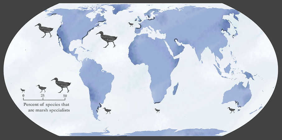
Maps. I've developed several adaptations of the primary map from Greenberg et al. 2006, which shows patterns of tidal marsh specialization globally. I designed these adaptations to use the Equal Earth projection and have the appropriate resolution for the intended outlet (e.g. PowerPoint slide vs. print. vs web).

Offshore wind
I've created several visualizations to support planning and decision making for offshore wind development, especially in the Atlantic Outer Continental Shelf. Links to the two primary apps, CollideR and RepoweR, will be live in early 2022.


Interactive visualizations for teaching
I've created several interactive apps with R 'Shiny' to communicate difficult concepts in statistics for teaching at the graduate level, especially Bayesian updating, uncertainty, and sampling. Screenshots from select apps are shown below; click to visit the apps.


